I know I’ve said this before, the old saying, don’t judge a book by it’s cover, but we still do. The cover is the first impression a reader gets. Does it convey the genre, what the story might be about, or provide some mystery? Not only should a cover do that, it also needs to be professional looking. Leaving book covers to take on a lot of responsibility. I was fortunate enough to have a super talented artist for a cousin (shout out to Kasey Regan!) who was excited to help out. Great! So I’ve got a professional…now what?
Do Your Research
First thing I did was research covers in my genre. Thrillers, techno-thrillers, sci-fi etc. Check out new, old, good, bad, and made a list of basic elements on each. Title font size, author name font size, the art work in each genre, colors used and so on. What I found was…well…sci-fi covers are mostly made up of ships and a planet, makes sense. 99% of thrillers had a silhouette of the main character with a plane, or drone, or them running down an airstrip or on the city streets of [insert-foreign-city-here]. They certainly checked the box of genre expectations.
Then What?
So I did my cover research and decided I wanted to do something a bit different. I didn’t have the silhouetted main character, and no space ships, so I went with the real main character…a satellite. Focusing on the story and plot points, I wanted the cover to be mysterious, simple, but still give a sense of genre. Technology is involved, a satellite is involved, and distance from objects (maybe perceived as distance between characts and lack of trust, but I’ll admit that’s a stretch). So with this in mind I put together a lookbook.
What’s a Lookbook?
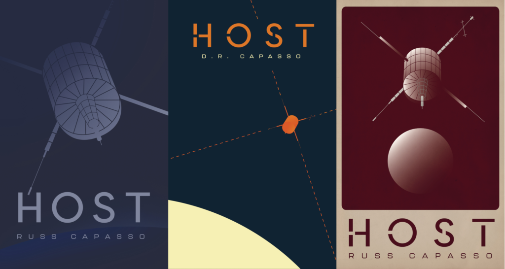
It’s a document, or even a short…uh…book, with ideas for design. I pulled images I liked, color palates, dropped the synopsis and logline in there, along with keywords and even a Spotify playlist. I wanted something minimalist, something that would stand out from the chaos of covers out there. I like those NASA tourist posters they made for various planets awhile back, they have this retro-future esthetic that I love. It tied nicely to the plot that maybe this signal has been around a long time…if you’re really paying attention to the cover. From there, I handed it off to my cousin and she came back with the following early concepts…
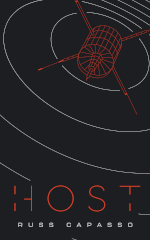
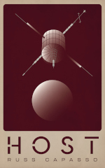
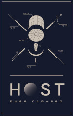

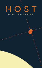
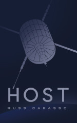
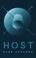
After getting the concepts I ran them by friends and family to see which ones stood out. Everyone, generally, picked the first red on black design. With a few tweaks to font style, size, and filling in the satellite to make it stand out more, I had a cover I was excited about. It also looks great with a matte finish, which I’ve gotten many comments / compliments about.
What I Learned
Of course, this process wasn’t all sunshine and rainbows. Towards the end of the design phase and before publish there was a lot of back and forth, and plenty of Zoom calls with my cousin to make sure we were on the same page (no pun intended). Some of the key things I learned that would’ve saved us time were…
How does the design look as a thumbnail?
Toward the end of the process my old man (aka Dad) said, yabut, did you check how it looks listed on Amazon? I did, and it didn’t stand out at all. The title and cover were too dark and got lost in the bright covers that litter the thriller genre listing page. That led to increasing the font size of the title, and making the satellite larger and a solid orange/red color. My name I was less worried about. I’m a new author. If you look at most books today, established authors sell books using their names in super-mega-large font then the title, because fans don’t give a shit about the title, they know that author will deliver what they want (another thing I learned just heading to the bookstore).
Know your trim size!
I knew what trim size was, but I didn’t know what trim size was. If that makes sense. I waited too long to learn the ins and outs of trim size, paper style, paper weight, and so on about book bindings. It can get a bit convoluted but there are standards, and a quick walk over to my bookshelf with a ruler would’ve saved me some headaches and back and forth with my designer. Knowing how it’ll impact your page count is important, and knowing cost impact when going to print. I’ve gotten feedback that my font size for paperback and hardcover is a bit small. It’s 12pt which is standard but then I looked at paperbacks and hardcovers on my shelf and most are 13 or even 14pt! Which bumps the page count so that 288 page book could’ve been 300, which when someone is spending $20+ for will feel like they’re getting their money’s worth. It’s science.
Auto-generated Templates
Print on Demand (POD) services will provide a nice and easy plug n play cover template for you. Of course, once you know your page count, trim size, paper etc. Once I figured that all out, generated these templates, and then sent to my designer, the process was easy to make tweaks. I could’ve had this much earlier in the process if I knew about the above (trim size etc), which would’ve reduced back and forth and introducing any confusion. Now I know, and knowing is half the battle.
There is certainly more I learned during the process but these stood out to me the most. These were the clear time-savers if I had done more research up front. Lessons learned. Overall, I absolutely enjoyed the process of creating the cover for HOST. My brain thinks visually, I could see what I wanted and had an artist that took what was in my head and made it real. Which is a cool feeling when you get back what you imagined. In the end, and going forward, my philosophy is that the cover should be an extension of the story the reader is about to read. It’s the gateway, the introduction of mystery, and maybe even a clue to what is about to unravel.